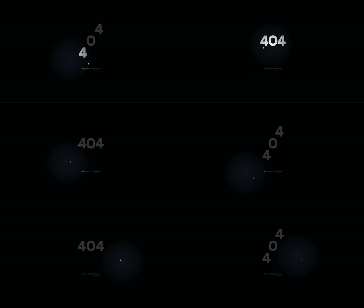
Flashlight in a dark page, a css effect based on mouse coordinates
What the hell is "Flashlight in a dark page"?
I'm talking about this kind of effect 👇, I just didn't know what's it called ¯\_(ツ)_/¯, so I made up a name.

I've never thought I'd be so damn easy till I figured out how joshwcomeau's 404 page works.
How to do it?
Give the
:root::before {
    content: "";
    display: block;
    width: 100%;
    height: 100%;
    position: fixed;
    z-index: 10000;
    pointer-events: none;
    background: radial-gradient(circle 12vmax at var(--cursorX) var(--cursorY),
     rgba(0, 0, 0, 0) 0%,
     rgba(0, 0, 0, .5) 80%,
     rgba(0, 0, 0, .8) 100%);
}
and define the value of css variables "cursorX" and "cursorY" based on mouse X and Y coordinates in JS:
document.addEventListener('mousemove', function(event) {
    document.documentElement.style.setProperty('--cursorX', event.clientX + 'px');
    document.documentElement.style.setProperty('--cursorY', event.clientY + 'px');
});
but how does it work?
Well the secret sauce is the radial gradient used as the background that stands as an overlay on top of the whole page, I'm not experienced with gradients but let's break it down.
As it's called, it's a circle shaped gradient, meaning there's always a center so you can play with the radius.
You getting what's going on right? the position of the circle changes based on the mouse movements, which results in the lighter colors, which is the circle, moving and creating kinda a flashlight effect.
I know it's kinda hard to get it if you're not familiar with gradients, but I suggest you visiting this great website called cssgradient.io and play around with the radial gradient to figure out something.